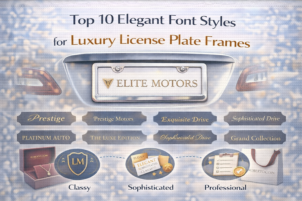
Nailing Down the Best Font for Military License Plate Frames
- billet frames
- Jul 25, 2025
- 2 min read
Why Fonts Even Matter Here

You ever see a license plate frame that just… looks off? Yeah, that’s usually a font fail. The right font says “I mean business,” not “I picked this up as an afterthought at the gas station.” Especially with military stuff, you want strength, order, and maybe a little bit of attitude showing. Plus, if people can’t read it as they pass by, what’s the point?
What To Consider Before Picking Your Font
Can You Even Read It?
If it looks like a ransom note or is all curly, skip it. People need to read this at a glance.
Will It Last?
Military frames see all kinds of weather. Pick something that’ll stay crisp even after a couple winters, and that works with engraving or whatever printing method you’re using.
Does It Actually Look Military?
The vibe should be tough, clean, and kinda no-nonsense. Save the Comic Sans for your kid’s science fair.
Rules, Rules, Rules.
Some states are picky about what you can slap on your plates. Don’t end up with a ticket because you went rogue with your font choices.
The Heavy Hitters: Fonts That Actually Work
1. Stencil Fonts
Instantly “military” with that classic stenciled gear look
Beefy, easy to spot, and scream authority
Go with:
Stencil
Army Stencil
Military Stencil
Pro tips: All caps, space it out a bit, and you’re golden
2. Blocky Sans-Serif Fonts
Big, bold, and you can read 'em from across the parking lot
Not strictly “military,” but strong and practical
Try:
Impact
Arial Black
Helvetica Bold
Futura Bold
Tips: Thick letters, all caps—no skinny, artsy stuff
3. Actual Military-Style Fonts
Built to look like they belong on a tank
Sharp lines, slightly industrial
Examples:
Machine (monospaced, industrial)
DIN 1451
Military
Use: If you want that full “I’m with the unit” vibe
4. Bold Serif Fonts
Old-school, super official—think chunky Times New Roman
Great for veteran frames
Don’t: Get fancy with it. No curly tails, just the basics
Design Hacks to Make It Pop
High Contrast: White text on black or black on army green—easy to read, looks sharp
Font Size: Bigger is better. Don’t squint at your own plate
Space It Out: Letters need room to breathe
Quality Materials: Go with metal or tough plastic, engraved or UV-printed. No one likes a faded mess
Keep It Short: “PROUD VETERAN” > “I SERVED FROM 1998 TO 2010 AND I’M REALLY PROUD ABOUT IT”
Know the Rules: Local laws can be weird; check before you order
Wrapping It Up Fonts aren’t just decoration—they’re the message. For military license plate frames, you want tough, clean, and built to last. Don’t overthink it, but don’t treat it like an afterthought either. Stencils and blocks are your friends. Make it bold, make it readable, and let that frame do the talking.


Comments